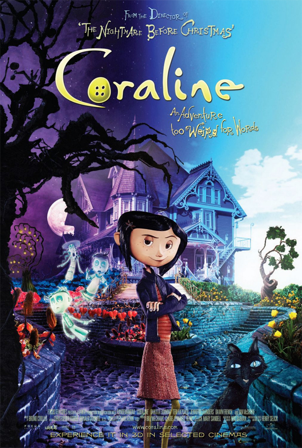
okay, i was going to just leave it at posting the image, but i couldn't walk away. i'm reverting back into my 3 hour critique school days. i can't just say "that looks goofy", and move on. let's get in there! i think what bothers me the most is how she's just plopped down in the foreground giving you that look. what is that look all about? the image is all about saying "hey, look at this crazy world we've got in store for you!", but she's not really reinforcing that. obviously the two sides are depicting the two worlds in the story; the real world and the other world. it's too bad she doesn't appear to exist in either one of them. there are some things wrong here that i won't go into, but i think it would bother me less if she were more integrated. possibly further back on the sidewalk, looking around or something? you know, exploring. Something as simple as having here stepping toward the "dark" side of the poster would speak volumes. there's my 2 minute hack critique.

1 comment:
wooooowwwww, talk about sexy, I dont remember this hot little thing when was working on it.
Maybe we got the R rating!
Love the new blog yo! Thanks for the link.
TC
Post a Comment